
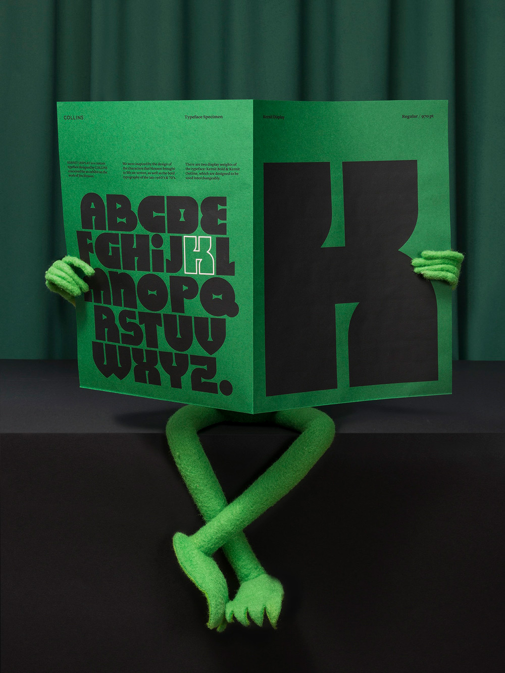
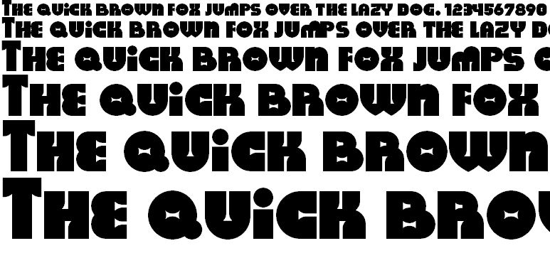
Kernit is a font inspired by the work of Jim Henson. [h/t Akimbo_NOT].
Full of curves, with the counters and eyes of the letters appearing squished, Kernit is full of energy, as if it could spring off the page. “Our goal was to build a voice that is both unique and true to Henson’s work and visual style,” they explain. “Each letter and character is meant to capture the same imagination, fun and whimsy which we came to love in his creations.”
As well as its obvious influences in its name and the colour palette of its specimen, Kernit was inspired by a host of Henson’s characters as well as the bold typography of the 1970s: an era of rounded edges. For example, Milton Glaser’s iconic “I love New York” logo with its curved serifs debuted in 1973.
from Boing Boing https://ift.tt/2w5nRYk
via IFTTT
0 comments:
Post a Comment